Monday Muse: Quentin Fiore

I just started reading War and Peace in the Global Village by Marshall McLuhan and it is another masterpiece. This book is made especially wonderful to read because of the graphic design of Quentin Fiore.

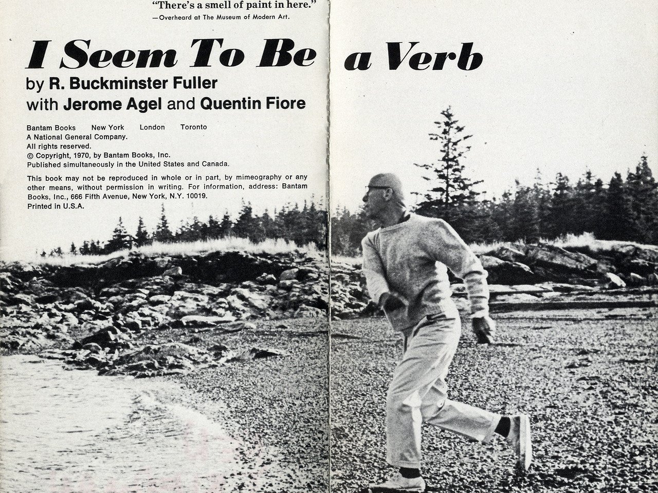
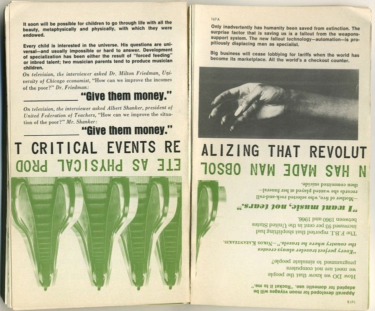
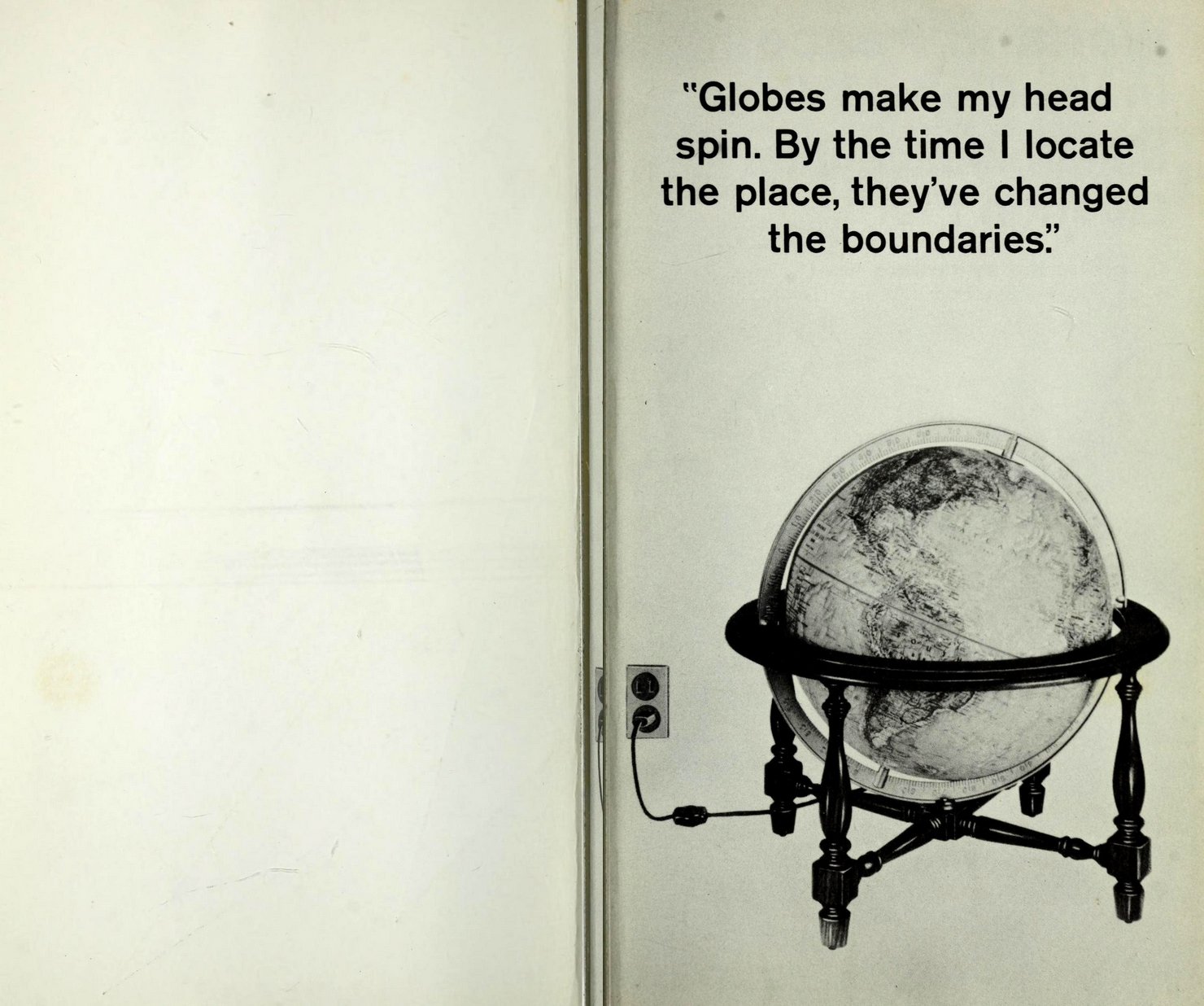
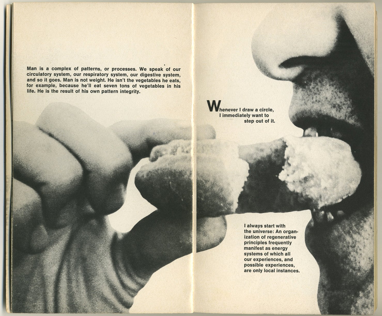
My dad had an archaic copy of I Seem to Be a Verb by Buckminster Fuller and I fell in love with the layout and design of the book. It had bold text punctuated by the most interesting pictures to illustrate different concepts. The different narratives of the book all ran concurrently and the book could also be read from front to back, back to front, and along the margins. The way the book was designed made some of Fuller’s more complex concepts more easily digestible. I didn’t know it at the time, but I was really obsessing over not just Buckminster Fuller’s philosophy but also Quentin Fiore’s graphic design.
Fiore began his career in graphic design in the 1940s, working as an art director for Christian Dior and Bonwit Teller. In the 1950s, he began doing more corporate ad work for Ford Foundation, Bell Laboratories, and RCA.
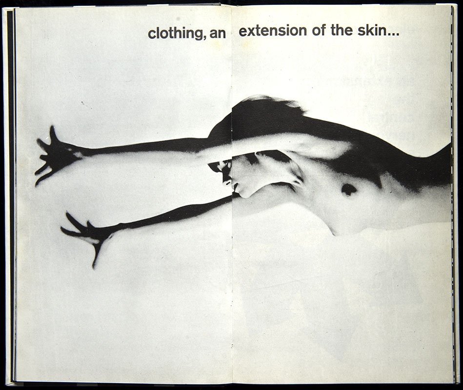
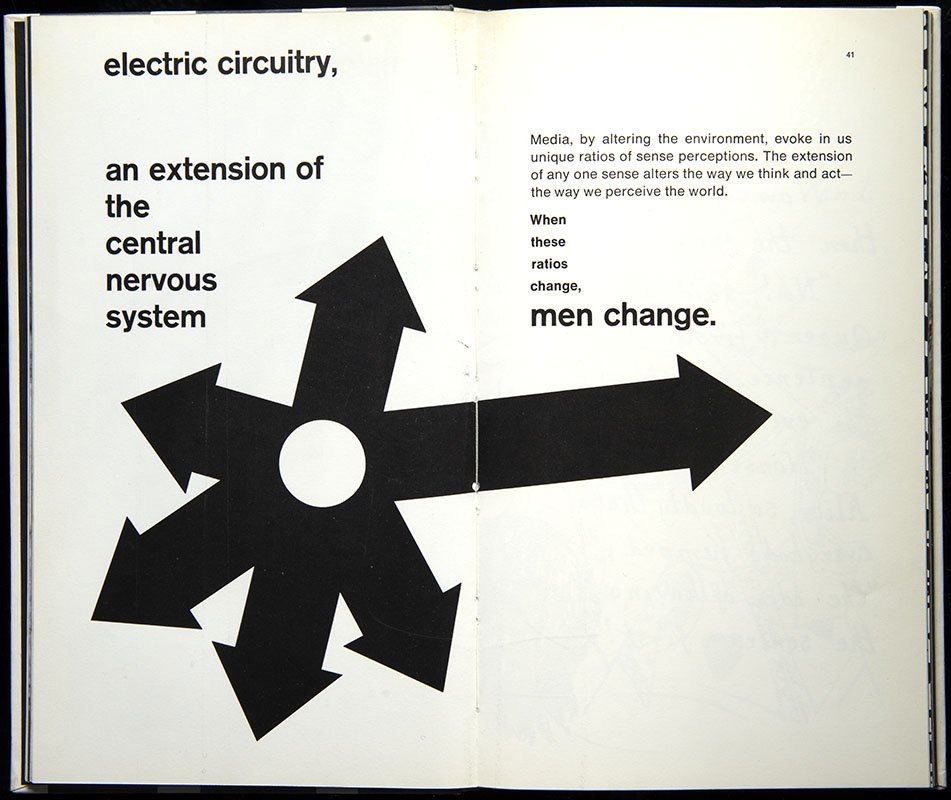
However, he is most noted for his collaborations with Jerome Angel, Marshall McLuhan, Buckminster Fuller, and other noted thinkers of the counterculture. The Medium is the Massage, the book by McLuhan and designed by Fiore has been described as an embodiment of the idea that “consciousness can be affected by the knowing collision of verbal and visual information.” Fiore intended to make McLuhan’s philosophies more readily accessible through visual interpretations, appealing to a younger audience.

This collision of text and images would be christened “typophotography” by media theorist László Moholy-Nagy to describe this form of visual storytelling. These books are truly innovative and their impact on publishing, design, and visual culture can not be understated. The clash of text and imagery is something we take for granted in today’s world. Just look at the design of this website, a full Fiore rip-off from the bold sans serif text to the primacy of images. The design of the books attempts to bridge the educational chasm that splits art from writing, uniting them in the most exciting way to deliver information and to allow the reader to make new connections, form their own opinions, and ultimately shift their perspective.
Ultimately, what I love even more about the way that Fiore illustrates and decodes the labyrinthine philosophies of McLuhan and Fuller is that while the graphic layouts can be minimalist, filled with humor, and obviously edited in such a way to bring the point across neatly and clearly, they always make you feel like you’re smart, like you’re part of the club, and that this knowledge is important for you to access. Knowledge shouldn’t be locked away in an academic cabinet for only the few to access but rather, made into something beautiful that all can understand.
Those that know me know that I am forever looking back to the 60s counterculture for inspiration and direction. Quentin Fiore’s design is a big part of that. His singular vision ushered in such a paradigm shift in media that we see all around us today.
